How the big names behind Super Bowl ad spending have changed over time
Super Bowl ads have now become a media event unto themselves, with ads to tease the ads, monthlong rollouts, relentless media coverage, and, here at our Charlotte marketing agency, an informal office pool on which ads will generate the most buzz. To make sense of which industries and companies are spending more (or less) over the last decade, check out this new Wall Street Journal interactive chart. It helpfully breaks down everything you could want to know about which advertisers are paying for their stab at everlasting, 30-second glory
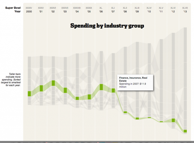
(anyone know why the finance and real estate sectors had such a sharp drop in spending around 2008?)
The graph explores Super Bowl ad purchases at three levels: overall, industry-wide, and individual companies. The overall analysis shows that the big names who pony up for commercials every year have actually changed quite a bit over time. Sure, beverage ads for Pepsi and Budweiser have been part of Super Bowl Sunday for years. But the automotive industry has come from spending a mere $8 million in 2000 to a whopping $96 million in 2013, taking the trophy for the highest spending industry group. Seeing the obscene numbers Chrysler paid Clint Eastwood to give a two minute pep talk to America feels like a fun, voyeuristic snapshot inside the insane media buys of American corporations.
Clicking a stream at the industry level zooms in on individual companies, with their Super Bowl ad spending floating above each year’s bar. Because the graph lacks a y-axis, those numbers would be nice to have at the overall and industry level as well. As it stands now, the user has to add up all of the bars in a given year to see how much was spent in total. One also wishes the graph sat on a baseline x-axis instead of floating symmetrically. The bottom half of the streams is a redundant mirror of the top half’s peaks and valleys. Streamgraphs have their place, but in this case there’s no reason the Journal couldn’t have used a stacked area chart, which would have been easier to read.
Smaller design affordances help make up for any UI problems. Trends sit above the graph, giving users a place to start if they arrive at the page uninterested. As you go deeper into the graphic, a series of breadcrumbs appear to tell users what they’re looking at and how they can return to a previous view. Details on each year’s game sit below the chart, along with links to memorable ads from each year.