The Psychology of Color at Retail
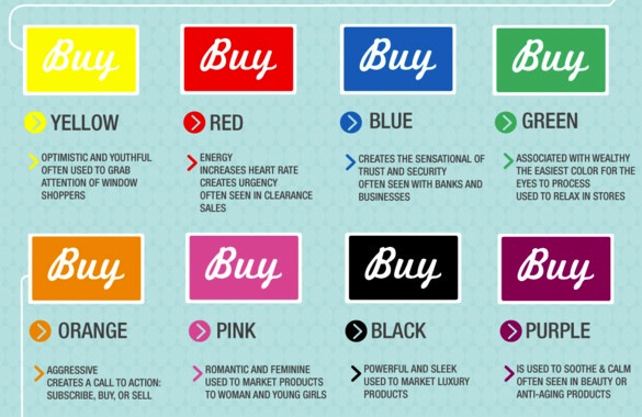
Color is the one major psychological influence that all retailers can wield. In fact, color can be everything to a successful store – especially if the palettes work well across the whole shop and complement other elements such as product displays and lighting. Color is also central to coherence because we react instinctively to it. Red means “stop” and green means “go.” Our brains are hot-wired to respond to color and, for modern retailers, the trick to using color is to understand both its physiological and psychological influences.
We react fundamentally to colors because they help us make sense of our surroundings; indeed, some 80 percent of information reaches our brains via our eyes. It means that we are instinctively more comfortable when colors remind us of something familiar – for example, a soft shade of blue triggers associations with the sky and a psychological sense of calm. Prisons and hospitals now use color to influence the behavior of inmates and patients.
In children, by contrast, those color associations are still being formed, which is why youngsters respond best to bright primary colors. Those bold colors are the color of most toys, clothes and children’s books – and the color schemes of the most successful kids’ retailers.
We all share similar responses to color, although some cultural variations exist. For example, white is the color of marriage in western societies but is the color of death in China. In Brazil, purple is the color of death. Yellow is sacred to the Chinese, but signifies sadness in Greece and jealousy in France. People from tropical countries respond most favorably to warm colors; people from northern climates prefer cooler colors.
Our heart rate and blood pressure rise when we look at intense reds; conversely, we can become tired or anxious by looking at large areas of bright whites or grays. In a retail environment, understanding those responses can be crucial to enticing a customer inside, and then enticing her to open her wallet or purse.
Color association also extends into food retailing. For example, most fast-food restaurants are decorated in vivid reds and oranges. These are colors that encourage us to eat quickly and leave – exactly what the fast-food operator wants us to do. Luxurious brands, on the other hand, favor softer colors that appear more sophisticated. In classier restaurants, those are the colors that encourage us to linger – and to order another glass of fine cognac.
Some retailers are now using carpeting to influence patterns of travel around a store – particularly from the crucial zone just inside the shop entrance, often referred to as the compression or transition zone – the place where customers first orientate themselves with what’s inside. Here, carpeting is being used to subtly direct shoppers deeper into the store or, by using different colors and patterns, create subconscious walkways that shoppers will tend to follow.
By recognizing how color influences us, retailers (and shopper marketing agencies like ours) are better able to induce feelings of warmth, intimacy or serenity – or, by using more vibrant palettes, to excite or stimulate. It’s about understanding target markets, the product lines to appeal to them and the kind of brand the retailer wants to convey. Lastly, it’s about conveying that brand though color and design.