The Pros and Cons of Logo Loyalty
If it ain’t broke, don’t mess with your mark.

Bank of America
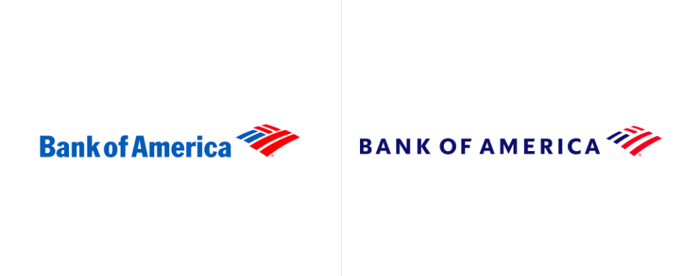
As a Charlottean who works at an uptown Charlotte marketing agency, I am inundated with bank corporate offices, none bigger than Bank of America. We see this logo and name on every block from the inner city to the suburbs so you can imagine how noticeable it was when the logo was changed in 2018. The bank, which changed its brand position and slogan (What would you like to do?) along with the logo, had not had a visual refresh of their logo since 1998. The goal with this design was to reflect the 20 years of technology that the bank had adapted since its last refresh. Tighter lines, more symmetry, and an updated typeface were used to give the bank an fresh look while improving clarity on smaller touch points like debit cards and checks.
But did it work? The approximately 67 million BoA members were relatively un-phased. They felt that with the flag remaining as part of the logo that nothing really changed. So all was well in this case. The same cannot be said for these other brands.

Gap
The Gap logo refresh during the Holiday season of 2010 came out of nowhere. After 20 years of strong retail success, the familiar, simple logo disappeared without any fanfare or heads up to audiences. The reaction was not what they had hoped for, and critics were vocal with their negative feedback on the new look. After spending an estimated $100M on the change, it disappeared after only six days in front of the public eye and the original design was restored. Gap’s PR team came out immediately to address damage control, and make the statement that this new logo design was part of a crowd sourcing process that was intended to help them reinvent the company. This, folks, is why you take the time, do the research, and hire a strategic branding agency to study brand equity and change prior to big launches and big spending.

Tropicana
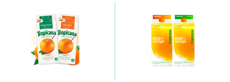
Across PepsiCo’s breadth of products facing design criticism, perhaps one of the most glaring was a logo and packaging refresh for Tropicana. As Pepsi was facing backlash for their Pepsi soft drink logo change, they were also looking to take on a design revamp for both Mountain Dew and Tropicana simultaneously. This was a lot to take on at once and maybe that is why the Tropicana refresh fell so flat.
The design team opted to scale down the logo in size and clean up the typeface, which lost the brand equity of the curved Tropicana letterforms that consumers were used to seeing. Additionally, while Tropicana is synonymous with OJ, the new packaging makes it hard to tell what’s in the carton. It feels more like a private brand and loses any clout that comes with the Tropicana brand and the history of making delicious juices.
The result: in a little over one month’s time after launch, Tropicana sales fell 20%, and cost the brand an estimated $30 million in sales. In the end, the original logo and packaging design was restored.
Brands are always (and rightfully so when appropriate) going to try and refresh and change their look to remain current and try and attract new customers. However, it is a process that needs to be vetted, tested, and researched before it ever facing a consumer’s eyes. Your logo is the second to the quality of the product you sell, and can be considered the gateway to get a consumer to purchase, so make sure that you have the right team in place when making a logo change.
Check out a few other brands that have had mixed results when throwing out the old in favor for the new:
https://blog.logodesignguru.com/5-logo-redesign-disasters/
Resources
https://www.underconsideration.com/brandnew/archives/new_logo_for_bank_of_america_by_lippincott.php
https://www.underconsideration.com/brandnew/archives/new_logo_for_bank_of_america_by_lippincott.php

