A Hugely Influential Typeface Designer Leaves Us, But His Characters Live On.
Praised for an elegant readability that belied their rigorous engineering, Adrian Frutiger's typefaces have graced signs from the Paris Métro to London streets.
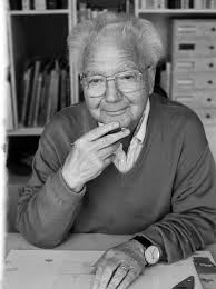
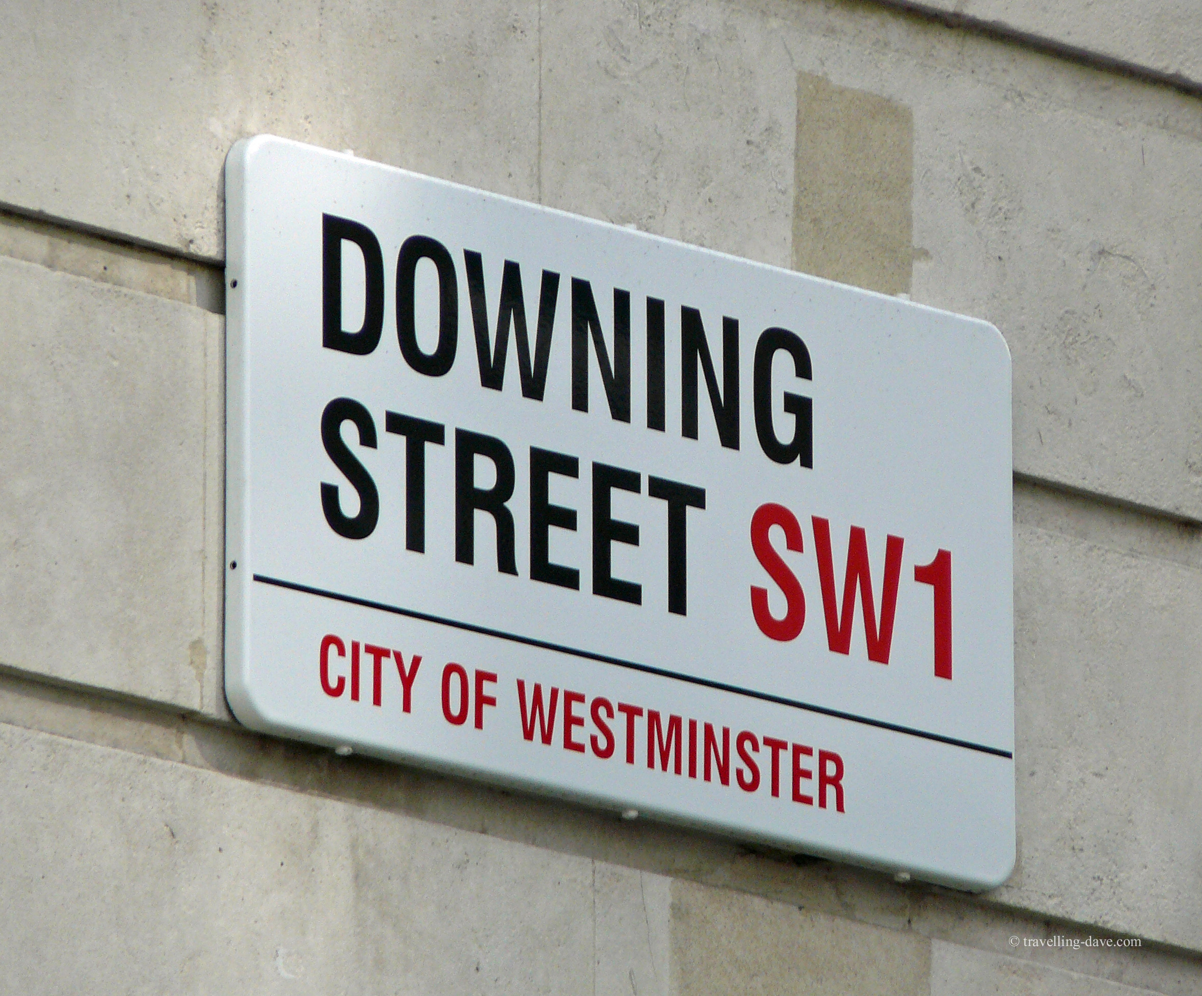
The Swiss typeface designer Adrian Frutiger passed away over the weekend, (you can read the New York Times obituary here). Throughout Frutiger’s prolifiic career, he created more than forty different typefaces that were widely praised for their ingenious engineering, style, and readability – appearing on signs in the Paris Métro (a custom adaptation of Univers) as well as, perhaps most iconically, on the street signs throughout London (Univers).
Univers was also a crucial design element of the 1972 Olympic Games in Munich. Another of his typefaces, named after himself (Frutiger), is utilized throughout John F. Kennedy International Airport in New York and Charles de Gaulle Airport in Paris.
 The optical-character font he designed in 1968, OCR-B, was adopted five years later as the standard across the world, including appearing at the bottom of personal checks. Born in 1928 near Interlaken, Switzerland, Adrian Johann Frutiger graduated from the School of Applied Arts in Zurich in 1952, after which he moved to Paris and became a designer with the type foundry Deberny & Peignot. He went on to become artistic director of the firm, and it was during his time there that Frutiger created the fonts Président, Méridien, and Ondine. He also founded his own studio in Paris by the early 1960s.
“A letter,” Mr. Frutiger told the English-language publication Swiss News in 2001, “follows the same canons of beauty as a face: A beautiful letter is in perfect proportion. The bar of a ‘t’ placed too high, the curve of an ‘a’ too low, are as jarring as a long nose or a short chin.”
Frutiger received many honors and awards throughout his lifetime, including the 1987 medal of the Type Directors Club. Additionally, an anthology of his work titled Adrian Frutiger — Typefaces: The Complete Works, was published in 2008. Our Charlotte marketing agency uses his typefaces on a regular basis, and although we are sad to lose such an influential talent, we are glad that his passion for good design and legibility will live on.


